


Re-imagining the online 3D Voyager tool
Promoting self-discovery by connecting users to their favorite exhibits online
Team
Ben Decker
Lexi Fogel
Christine Pak
Arjan Guglani
My Role
UX Researcher
UX/UI Designer
Tools
Figma
UserTesting.com
Miro
This past year, my team and I collaborated with the Smithsonian Institution’s Digitization Department to redesign their 3D Voyager platform. Our goal was to increase overall accessibility while maintaining the in depth and unique experience of the Voyager.
The 3D Voyager creates digital replicas of Smithsonian exhibitions that can be accessed and studied by researchers educators, and the general public. The immersive experience includes educational features about the artifacts, as well as ways to for users to alter its material, lighting, view, and many more.

The Problem
Many users are not utilizing the Smithsonian Voyager application to its full potential. The platform does not efficiently support a self-directed learning experience due to the complexity of the interface and its tools. The application is created to promote learning, and the confusion that arises with using its features greatly diminishes the platform's goal.
Essentially, the Smithsonian wants to
Enhance the usability of 3D Voyager experience to better connect their users to learning and ensure no tool is underutilized because of confusion
Our audience & objectives
We defined our primary target audience for the research and design phases, specifically addressing educators, students, and lifelong learners. Furthermore, we prioritized the inclusivity of the platform to accommodate individuals with hearing or visual impairments, aiming to benefit a broader spectrum of users.
Who are we designing for?

What are we looking for?

After meetings with our clients, we began our Research and Exploration Phase
To gain deeper insights into the current limitations of the Voyager, my team and I devised a research approach encompassing a competitor analysis, heuristic evaluations, usability testing, interviews, and field studies. Employing this comprehensive approach, we would assess user perceptions of the tool and collect valuable feedback for potential improvements.
Heuristic Evaluation
Every team member conducted an individual heuristic evaluation, which enabled each of us to become acquainted with Voyager's interface and initiate discussions regarding the usability concerns we personally identified.

Competitive Analysis
By studying other platforms that share similar objectives and interfaces, we gained valuable insights into effectively introducing new features and enhancing existing ones to improve the accessibility of the Voyager.

Usability Tests
We initiated our usability testing process by crafting a set of tasks that comprehensively used the capabilities of the Voyager 3D platform. We promoted our Zoom-based tests through social media channels and engaged 12 volunteers from Usertesting.com, resulting in a total of 24 usability tests conducted.

Power User Interviews
We conducted interviews with more than 10 educators and power users (individuals experienced with 3D tools) to gather their perspectives on the Voyager, focusing on its educational effectiveness and the usability of its 3D features.

Key Quotes

Affinity Diagram

Field Studies
My team and I made an additional effort to collect data on the interaction of museum visitors with technology within physical spaces. This enabled us to observe how individuals were actively engaging with interfaces in environments similar to that of the Voyager.


After our research and analysis was complete,
here is what we found
3D Voyager users feel lost throughout their online journey. They feel overwhelmed with confusing options, lack an understanding of the site’s purpose, and are not engaged in learning about these objects presented.
As a result, they spend more time learning how to use the site’s features than interacting with the object- if they don’t log off in that time.
And here's why:

Underutilization of the tour feature
The Tour feature holds significant promise, but it faces challenges related to usability and aesthetics that deter users from prolonged interaction. The primary concern with the tab lies in its initial presentation, as it solely displays artifact listings and descriptions. Users must discover that they need to click on a card to initiate the tour, otherwise, this valuable functionality remains underutilized.


Confusing symbolism
A significant number of participants found it challenging to anticipate the functions of each tab within the menu when we posed the question. It became evident that the globe icon representing tours and the chat bubble icon representing annotations were not sufficiently intuitive. To address this issue, we recommend adding descriptive captions to the icons or substituting them with more clearly indicative imagery.


Tool clutter
Even a study participant with experience in the 3D industry struggled to grasp the potential uses of certain material views, resulting in added system complexity with minimal benefit. In certain menus, none of our study participants could discern the reasons behind making specific alterations to the model.

Insufficient user guidance
The tab menus and certain modification options lack adequate explanations, leading numerous users to rely on trial and error for understanding their functionality. Consequently, some of the more intricate features remain unused because of insufficient or absent documentation guiding users on their utilization.

All of which, led us to determine
these 4 UX requirements

And just like that, we began
Our Design Journey
User Flow Mapping
We initiated the design phase by conducting an in-depth user flow analysis. We charted the existing Voyager flow, deliberating on its logical and illogical aspects. Leveraging insights gathered from our research, we brainstormed strategies to restructure the flow. Managing the flow for this project presented a challenge due to various user entry points, but our aim was to ensure a cohesive experience that encouraged users to explore all tools and features.


Design Process & Iterations
We initiated the process by sketching our ideas on paper. As we collaborated on layout concepts, we explored ways to optimize space usage and balance to establish a coherent user direction while maintaining an aesthetically pleasing interface. Below, you'll find the complete timeline of our design iterations.
Sketches
January

At this point, we initiated discussions on the redesign of the tool, engaging in brief brainstorming sessions to kickstart the ideation process and spark conversations related to our design challenges.
Wire-framing
February


As a team, we selected the physical sketches that resonated most with us and proceeded to transform them into digital wireframes. This phase primarily entailed a continuous cycle of transitioning between hand-drawn sketches and digital representations.

The innovative ideas generated in the preceding stage are put into action, with a strong emphasis on the extensive development of the user interface. Throughout this period, our primary focus remains on refining the interactive flow. This phase demands meticulous attention to detail, and we've been diligent in polishing, reviewing, and editing every element of the design.
March - April


We solidified our consensus on the concepts guiding our revisions and delved into experimenting with layouts based on these fresh ideas. Naturally, there was a considerable amount of revisiting and editing of concepts that didn't align with the technical aspects of the design.
Component Library
Once we reached a consensus on the desired appearance of our user interface, our team crafted a design system to maintain consistency in our prototypes and streamline the process, ensuring alignment with the Smithsonian's branding guidelines.

Which brings us to the
Visualized Design Solution
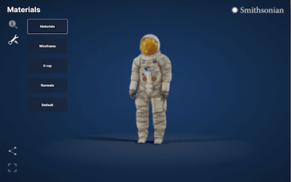
Simplified tours module

In our latest iteration, we facilitated users' ability to associate presented information with specific objects. This was achieved by incorporating numerical labels for each Tour step and corresponding floating bubbles that matched the object numbers. Furthermore, we enhanced the touch targets for our navigation buttons, ensuring intuitive control. Our resulting interface prominently highlights the Tour content and offers a user-friendly and easily manageable experience.
Tool tips

In direct response to our iterative user testing, we introduced verbal descriptions for features that necessitated specific actions. Although some elements of the Voyager are designed to be 'intuitive,' our research indicated that the majority were not. Rather than incorporating an extensive how-to or information section within the platform, we chose to provide users with concise captions to guide them through the various tools and features they encounter.
Verbose iconography

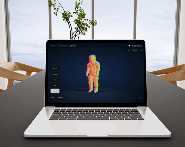
We completely redesigned all the buttons and replaced iconography with ones that users resonated with more. We also increased the touchpoint sizes of our buttons since the original area was too small to be accessed. In addition to clearer icons, we added a hover state where the name of each feature is explicitly labeled. This way, the user will always be aware of what they will be clicking into before accessing a new feature. Through this, we were able to keep the iconography as minimal yet as clear to the user as possible.
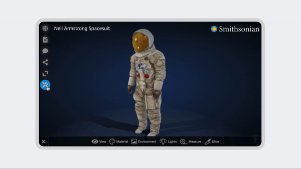
Reorganized Navigaion

We enhanced the tool's descriptiveness by implementing comprehensive text labels, straightforward manipulator choices, and a fixed menu system located in the bottom-left corner. This breadcrumb-style menu effectively prevents users from losing their way within the interface and empowers them to navigate back to any previous pages. Furthermore, we incorporated a reset button at the top right, along with redo and undo options for added functionality.
Post design testing
While analyzing test data, we aimed to assess variations in perceived ease of use and completion times for articles, tours, annotations, and tools. We conducted a numerical analysis to compare baseline test results with those from a prototype test round. Notably, many users praised the new tool's efficiency, frequently using terms like "simple," "easy," and "intuitive," marking a significant improvement compared to our initial research findings.
Results

User testing overview

01 Keeping it accessible for everyone
We would have loved to include language accessible options, as some of the complex terms do not have direct translations. Adding an option for articles and tour features to be played as audio would have been important for those with visual disabilities, as well.
02 Interactive learning activities
Adding new ways to make the learning features interactive, such as taking a quiz or being connected to an expert, would take the diffusion of knowledge to another level. Ideally, we would have interviewed more teachers to get opinions on how they would use the tool in their classrooms.
My final thoughts
I had a great experience owning the end-to-end design research and process, and collaborating on an incredible team. Learning to keep communication with stakeholders and clients was great experience for the real world. I want to thank my team members, Jamie Cope and Meg Drater in the 3D Digitization Department. I know that the best has yet to come, and this was just the tipping point!